What They Are, Why They Exist, and What They Tell You
Note: Holon Pulse treats Gc spending as realized economic capacity, not hypothetical income replacement, because one of our core assumptions is that most PtP participants operate under high marginal propensity to consume. Long periods of income stagnation have put enormous pressure on the average wage earner, and most families have had to cut corners to keep the ship afloat. We mean to change that and PtP is our engine for doing so.
First: What These Metrics Are Not
These are not raw statistics.
They are interpretive transforms built on top of authoritative inputs.
Think of them as:
- normalized signals
- ratios that collapse multiple variables into a decision-ready form
- playable abstractions that sit between reality and action
Raw data answers “what is happening?”
Derived metrics answer “what does this imply for behavior, incentives, and system design?”
That distinction matters.
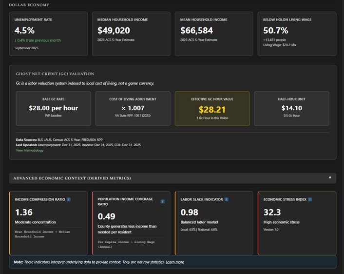
1. Income Compression Ratio (ICR)
Formula
Income Compression Ratio =
  Average Household Income ÷ Median Household Income
Why This Exists
Median income tells you where the “middle” actually is.
Average income tells you how much money exists in total.
The ratio between them tells you how unevenly that income is distributed.
This is a classic inequality signal, but deliberately chosen over flashier measures (like Gini) because:
- it’s intuitive
- it’s stable year-to-year
- it maps cleanly to behavioral outcomes
How to Read It
- ~1.0–1.2
Income is broadly clustered. The “average” person is close to the median person. - 1.3–1.5
Moderate concentration. Some high earners are pulling the average upward. - >1.6
Significant skew. A minority controls a disproportionate share of income.
Russell County at 1.36 sits squarely in the moderate concentration zone.
Why This Matters in PtP
In a Gc economy:
- High compression ratios correlate with:
- higher probability of Gc accumulation by a minority
- stronger guild power asymmetries
- increased importance of demurrage as a circulation control
- Low compression ratios correlate with:
- flatter participation curves
- more evenly distributed quest engagement
- less need for corrective economic mechanics
This metric doesn’t judge inequality.
It tells you what kind of economic gravity field you’re operating in.
2. Population Income Coverage Ratio (PICR)
Formula
Population Income Coverage Ratio (PICR)Per-capita income ÷ Living wage (annualized)Living Wage (Annualized)
Note: Per-Capita income, not household, income is used deliberately. Gc are minted and awarded to people, not families. It matters because elsewhere on the dashboard we’re tracking Median Household Income, which is appropriate for that context. This is a different context.
Why This Exists
This metric answers a brutally simple question:
Can a typical person, working in the local dollar economy, clear the baseline required to live without subsidy?
Everything else—food insecurity, emergency load, quest urgency—fans out from this.
How to Read It
- < 1.0
The median individual does not meet the living wage.
Structural shortfall exists. - ≈ 1.0
The median individual barely clears the threshold.
Fragile equilibrium. - > 1.2
There is buffer. People have slack.
Russell county’s 0.49 tells a subtle, dangerous story. The county isn’t broken but, it is structurally underpowered. It relies on:
- “Heroic effort” to stay afloat
- Informal caregiving
- Multi-earner households
- Federal transfers
- Out-migration of working-age adults
In short, it’s a fragile boat that could easily capsize.
Why This Matters in PtP
This is one of the most actionable signals in the system:
- Low LWCR implies:
- survival-oriented quests dominate demand
- emergency multipliers are not edge cases—they’re systemic
- Gc minting is likely to function as primary economic scaffolding, not supplement
- High LWCR implies:
- greater appetite for long-horizon, infrastructure, and optimization quests
- lower baseline urgency
- slower Gc velocity unless actively stimulated
If you understand nothing else, understand this:
LWCR tells you whether your holon is playing defense or offense.
3. Labor Slack Indicator (LSI)
Formula (Current Implementation)
Labor Slack Indicator =
  Local Unemployment Rate ÷ National Unemployment Rate
(Versioned and subject to refinement, but intentionally simple for now.)
Why This Exists
Unemployment alone is misleading.
A 4.5% unemployment rate means something very different if the national rate is 3% versus 6%.
This indicator answers:
Is this holon relatively labor-rich or labor-constrained?
How to Read It
- > 1.0
Excess labor relative to national baseline. - ≈ 1.0
Balanced labor market. - < 1.0
Tight labor market.
Russell County at 0.98 is essentially neutral—no massive slack, no acute shortage.
Why This Matters in PtP
Labor slack influences:
- onboarding friction
- quest availability pacing
- whether the limiting factor is people or coordination
High slack:
- onboarding quests make sense
- low barriers increase participation
- marginal labor has low opportunity cost
Low slack:
- prioritize high-impact, high-leverage quests
- reward multipliers make sense
- poor quest design becomes actively harmful
LSI tells you whether the holon’s bottleneck is human availability or system organization.
4. Economic Stress Index (ESI)
What It Is
A composite heuristic, not a sacred number.
Example Formula (v1.0)
Economic Stress Index =
  (Unemployment Rate × 0.4)
+ (% Below Living Wage × 0.4)
+ (1 – Living Wage Coverage Ratio) × 0.2
Weights are:
- explicit
- documented
- versioned
- debatable (by design)
Why This Exists
Sometimes you don’t want four graphs.
You want to know:
Is this holon under economic strain right now?
ESI is a single-glance triage tool, not a policy engine.
How to Read It
- Low
The system has slack. Focus on growth and resilience. - Moderate
Mixed conditions. Balance survival and investment. - High
Structural stress. Emergency capacity, redundancy, and rapid response matter more than optimization.
Russell County’s 35.5 (High) aligns with what the other metrics already told us independently—this is a stressed system.
That convergence matters.
Why This Matters in PtP
ESI:
- justifies emergency quest premiums
- contextualizes demurrage optics (“why is decay acceptable here?”)
- gives admins cover for prioritization decisions
Crucially:
ESI does not automatically change rewards.
It informs humans and systems that conditions have changed.
Why These Metrics Are Bulletproof (When Used Correctly)
- They are ratio-based
Ratios survive inflation, scale, and partial data better than absolutes. - They cross-validate each other
When multiple derived metrics point in the same direction, confidence increases. - They do not pretend to be neutral
They are openly interpretive, not falsely “objective”. - They map cleanly to game mechanics
Every metric has an obvious downstream use:- quest weighting
- emergency flags
- guild power analysis
- circulation tuning
The Big Picture (Why This Belongs in a Game)
Games fail when players cannot see the system they’re in.
These metrics:
- make invisible pressures visible
- turn “vibes” into signals
- let skilled players play the economy, not guess at it
This is not about telling people what to do.
It’s about giving them enough resolution to make informed choices—and then living with the consequences of those choices. In our view, that’s both good game design and honest systems design.